Absolute Ads

What impresses me most about ABSOLUT VODKA, one of the world's top 10 alcohol brands, is its print ads.
Absolut Vodka's print ads are composed of classic creative themes and unlimited executive ideas. The direction of its creative theme appeal is very clear.
In its print ads, it does not show the characteristics of the product itself, not focus on the product quality and efficacy, not boast its widespread popularity, but only a combine a classic and changeless short neck shoulder round bottle shape with different aesthetic perspective and cultural concept tightly, give consumers a fresh and novel visual impact.
When the campaign started, Absolut had a measly 2.5% of the vodka market. When it ended in the late 2000s, Absolut was importing 4.5 million cases per year, or half of all imported vodka in the U.S.
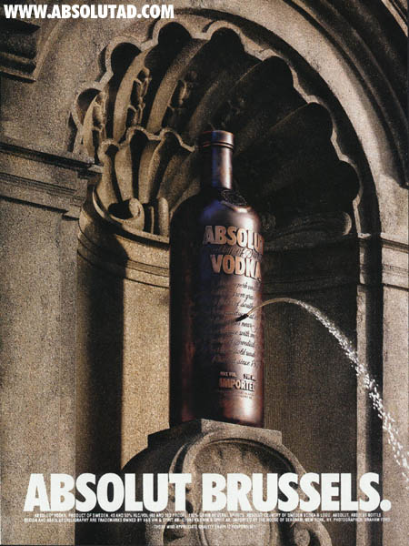
Today, I will show you some Abosolut Vodka ads with city concept. All the advertisements start with "ABSOLUT" and add a city name. "ABSOLUT" is the only basic image symbol that can be identified in all the print ads, which makes the brand image have strong visual effect and is conducive to improving the recognition of the brand. The shape of the bottle is perfectly combined with the things that represent the culture of the city, so that vodka can be separated from the elements of the culture of the city and enhance the brand image.


I think Tito's also does well in branding itself on digital platforms.:p
ReplyDeleteI can't agree more.
Delete